
Responsive Web Design
It’s no secret that the desktop computer is slowly being over taken by mobile surfing. When I say mobile surfing I am not just talking about cell phones but also including tablets, and e-readers in the mix. With people being busier than ever and the amount of people who have mobile devices it’s no wonder they are taking over, and that makes it more important than ever to design with mobile in mind. As designers we need to be able to deliver our clients content in a responsive manner, so that no matter which device the user is browsing the content on, we deliver it perfect.
Delivering Our Content….. Cleverly.

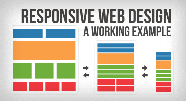
Responsive design is the process of taking our content we have developed for desktop, and making it change in accordance to the device, or more specific the screen size in which our content is being viewed. If you look at the image above, you will see on the far left we have our desktop content. Its large, a lot of space and plenty of room for just about anything we want to show our viewers. In the middle we have our content being responsive to the smaller size of the tablet. You will notice instead of side by side a lot of our content is starting to stack. This helps keep our content readable, and easy on our users. In this version we more than likely would reduce any number of ads we had showing in side bars, and maybe hide some content that we feel is less important. In the final version on the right we have our mobile version. This version would be very broken down, only the most important content is being delivered in order to keep it easy to read, a pleasure to see, and that makes our user comfortable using his mobile device to browse our site. Want to see how this works? Check out this site on your mobile, you will see the content delivery changes depending on your devices screen size.
Mobile Statistics
According to pewinternet.org’s fact sheet 90% of American adults have a cell phone, and over 58% of those phones are smartphones such as the IPhone. In addition to cell phones, 42% of American adults own a tablet computer, and at least 32% own an e-reader of some kind. This makes the need for having responsive content extremely important. Mobile is king! When you wake up every morning, chances are the first thing you grab is your mobile, and maybe you check the weather, latest news on TMZ, or your email. The mobile phone is most Americans first screen they see everyday and as these next statistics show, the phone doesn’t even have to be used as a phone to be important.
67% of cell owners find themselves checking their phone for messages, alerts, or calls — even when they don’t notice their phone ringing or vibrating.
44% of cell owners have slept with their phone next to their bed because they wanted to make sure they didn’t miss any calls, text messages, or other updates during the night.
As you can see designing for mobile is becoming imperative, and as a professional it should be done every single time you design a website. Don’t fall behind this trend, its here to stay as the numbers suggest.

Starting Out & Simplify Your Mobile Content
Its important to make the mobile viewing experience for your users pleasing. The goal is to get them to stay on the site and to view your content right? When we look at the image above and think back to the responsive flow image at the top, you can see the content is still there, its just structured differently. The key is to make sure the most pertinent information is there for your users, and sometimes that may come with some compromises such as hiding certain images when the site is being viewed on smaller screens such as an IPhone 4s. One of the biggest things I have learned when it comes to making sure my pages are mobile responsive is to design “mobile first”. Look at the smaller picture, and then using breakpoints build my site up to the way I want it to look on the desktop. It is much easier to design with minimal content, then adding more as you have the room. Taking some time and sketching out and planning your sites goes along way as well. Don’t skip these steps and your life will be much easier.
To find out more on responsive webdesign and breakpoints check out these articles from the Google Developers page: https://developers.google.com/web/fundamentals/layouts/rwd-fundamentals/how-to-choose-breakpoints?hl=en